理解 CSS 画三角形的原理,了解 em 单位的最佳实践,并且使用 React 搭配 classnames 封装原子组件
CSS 画三角形
- 三角形为等腰直角三角形
- 主要利用的核心属性就是
border
首先,我们先画一个普通的正方形:
div {
  width: 100px;
  height: 100px;

  border: 1px solid skyblue;
}

下面我们将边框的宽度数值调为调整为 width 的一半:
div {
  width: 100px;
  height: 100px;

  border: solid skyblue;
  border-width: 50px;
}

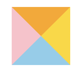
然后给四个边设置为不同的颜色:
div {
  width: 100px;
  height: 100px;
  border-style: solid;
  border-width: 50px;
  border-color: orange gold skyblue pink;
}
接着设置为 border-box:
div {
  width: 100px;
  height: 100px;

  border-style: solid;
  border-width: 50px;
  border-color: orange gold skyblue pink;
  box-sizing: border-box;
}
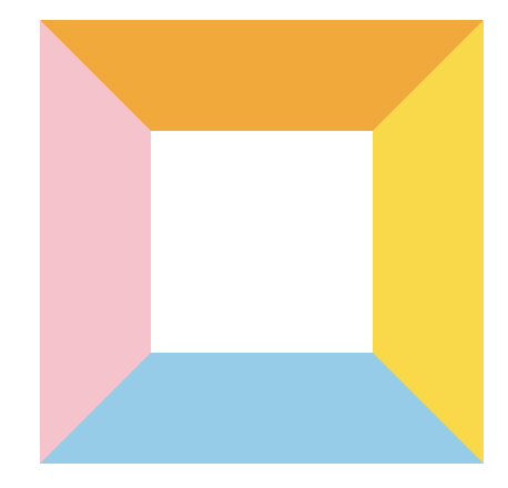
border-box 会让盒子的 width/height 属性控制 border + padding + content 的大小,
由于 margin 为 0,因此目前整个盒子的占位大小为 100px * 100px,全部都由 border 来占位:
可以看见,整个盒子都是由四个边框构成的,每个边框都是一个 等腰直角三角形, 接下来想办法切割想要的方向的三角形即可。
这里我们来切割蓝色的那个三角形,只需要把其他三个边框设置为透明色:
div {
  width: 100px;
  height: 100px;

  border-style: solid;
  border-width: 50px;
  border-color: transparent transparent skyblue transparent;

  box-sizing: border-box;
}
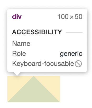
这样我们就得到了蓝色的三角形:
但是它的占位有点问题:
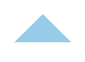
想要把它的高度也调整为 50px,就需要把对边宽度调整为 0,并且把指定的 width/height 去掉:
div {
  border-style: solid;
  border-width: 0 50px 50px 50px;
  border-color: transparent transparent skyblue transparent;

  box-sizing: border-box;
}
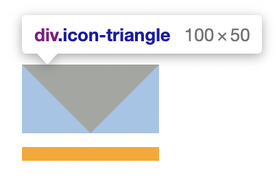
这样一来我们就得到了一个完美的 等腰直角三角形。这个三角形的底部等于 border-width * 2,高等于 border-width。
下面来总结一下核心要点:
- 设置怪异盒子模型:
box-sizing: border-box - 边框设置为实线:
border-style: solid - 设置边框宽度即三角形的高度,想要的三角形对边宽度设置为 0:
border-width: 0 50px 50px 50px - 留下想要的三角形的颜色,其余边框设置为透明色:
border-color: transparent transparent skyblue transparent
改造三角形
由 font-size 决定大小
在上面我们所画的等腰直角三角形中,它的高度是固定的,现在我想把它改造为一个字体图标,通过 font-size 就能够改变它的大小。
这时需要把 div 替换为一个 span,然后在外层包裹一个 div:
<div class='icon-triangle'>
  <span></span>
</div>
.icon-triangle {
  display: inline-block;
  line-height: 0;

  span {
    display: inline-block;

    border-style: solid;
    border-width: 0 1em 1em 1em;
    border-color: transparent transparent skyblue transparent;

    box-sizing: border-box;
  }
}
需要注意的是这里要给外层 div 设置为内联块,并且添加一个 line-height: 0,然后还要给里面的 span 设置为内联块,目的是让外层 div 宽高完全由内部的 span 高度撑开。
最重要的就是把内部 span 的 border-width 的单位设置为 em,作用是让等腰直角三角形的高由 .icon-triangle 的 font-size 决定。
这样一来,.icon-triangle 的 font-size 就是等腰三角形的高度了,比如 font-size: 30px,那么这个等腰三角形的高度就是 30px。
在直角顶添加一条直线
对于一些视频播放的继续播放按钮,通常是下面这个样子:

下面我们继续改造我们的三角形,为直角顶添加一条直线:
.icon-triangle {
  display: inline-block;
  line-height: 0;

  span {
    position: relative;

    display: inline-block;
    box-sizing: border-box;
    border-style: solid;
    border-width: 1em 1em 0em 1em;
    border-color: orange transparent transparent transparent;

    &::after {
      content: "";

      position: absolute;
      top: 0.2em;
      left: -1em;

      width: 2em;
      border-top: 0.2em solid;
      border-top-color: inherit;
    }
  }
}
在 span 后面加上一个虚元素,然后通过绝对定位,向下移动一段距离即可:

为了让它由 font-size 决定大小,因此使用的 em 单位,唯一的瑕疵就是这个伪类是脱离了文档流的,整个图标盒子大小没有包含这个伪类进去:
最后,想要调整这个图标的方向,只需要使用 transform: rotate 来旋转指定的角度即可。
封装 TriangleButton 组件
这里我们使用了 classnames 这个库,它的主要作用就是用来根据传入 React 组件的 props 进行类名拼接从而实现不同的样式。
Props 接口定义
首先,我们给 TriangleButton 定义一个 Props 接口,它基本上抽象出了整个组件的功能:
interface TriangleButtonProps {
  // 图标大小
  size?: "small" | "normal" | "large" | number;
  // 图标颜色
  color?: "black" | "white" | "orange" | "skyblue" | "red";
  // 是否有垂直线
  hasVerticalLine?: boolean;
  // 图标方向
  direction?: "up" | "right" | "down" | "left";
  // 点击事件回调
  onClick?: React.MouseEventHandler;
}
组件实现
const TriangleButton: React.FC<TriangleButtonProps> = (props) => {
  const { size, color, direction, hasVerticalLine, onClick } = props;

  const classes = classnames("triangle-button", {
    left: direction === "left",
    right: direction === "right",
    down: direction === "down",
    up: direction === "up",
    "small-size": size === "small",
    "normal-size": size === "normal",
    "large-size": size === "large",
    "vertical-line": hasVerticalLine,
  });

  const sizeStyle = typeof size === "number" ? { fontSize: size + "px" } : {};

  const colorStyle = ["black", "white", "orange", "skyblue", "red"].includes(
    color
  )
    ? { borderTopColor: color }
    : {};

  const style = { ...sizeStyle, ...colorStyle };

  return (
    <div className={classes} onClick={(e) => onClick?.(e)}>
      <span style={style}></span>
    </div>
  );
};

TriangleButton.defaultProps = {
  color: "black",
  size: "normal",
  direction: "left",
  hasVerticalLine: false,
};

export default TriangleButton;
样式实现
$direction-map: (
  "top": rotate(180deg),
  "right": rotate(270deg),
  "down": rotate(0deg),
  "left": rotate(90deg),
);

$size-map: (
  "small-size": 8px,
  "normal-size": 16px,
  "large-size": 24px,
);

.triangle-button {
  display: inline-block;
  line-height: 0;
  cursor: pointer;

  @each $key, $value in $direction-map {
    &.#{$key} {
      transform: $value;
    }
  }
  @each $key, $value in $size-map {
    &.#{$key} {
      font-size: $value;
    }
  }

  &.vertical-line {
    span::after {
      content: "";
      position: absolute;

      top: 0.2em;
      left: -1em;

      width: 2em;

      border-top: 0.2em solid;
      border-top-color: inherit;
    }
  }

  span {
    display: inline-block;

    border-style: solid;
    border-width: 1em 1em 0em 1em;
    border-color: black transparent transparent transparent;

    box-sizing: border-box;
    position: relative;
  }
}